
Color is one of the most powerful elements in interior design, especially when it comes to living spaces. It influences mood, perception, comfort, and even how large or small a room feels. A well-planned color palette can completely transform a basic space into a visually rich and emotionally balanced environment. In modern homes, designers carefully integrate tones, textures, and finishes to reflect personality and functionality. Many homeowners now explore refined living room décor ideas to achieve interiors that are both stylish and practical, ensuring harmony between walls, furniture, and decorative elements.
Psychological Impact of Colors in Living Spaces
Colors directly affect human emotions and behavior. Warm shades like beige, cream, terracotta, and soft browns create a sense of comfort and warmth, making them suitable for family-centric living rooms. On the other hand, cool tones such as blue, mint green, and soft grey promote relaxation and calmness, ideal for contemporary minimalist homes.
Bright shades like mustard yellow or teal are often used in moderation to introduce energy and vibrancy. These emotional responses to color are why designers carefully plan palettes that align with the purpose of the space. A living room meant for social gatherings may have energetic tones, while a relaxation-focused room may lean toward neutral and muted shades.
Color and Spatial Perception
Color plays a major role in how we perceive space. Light colors reflect more natural light, making small rooms appear larger and more open. White, off-white, and pastel tones are commonly used in compact urban homes for this reason. Dark colors, however, add depth and sophistication when used strategically, especially in larger living rooms.
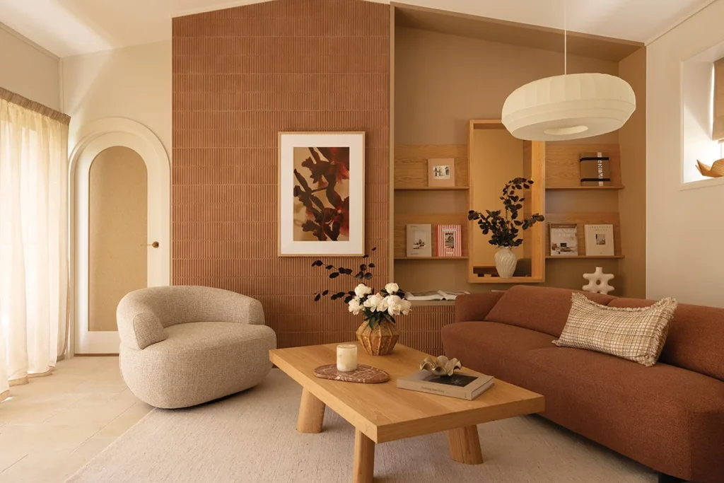
When paired with thoughtful lighting, darker shades can create a luxurious and intimate atmosphere. This balance is especially important when designing feature areas such as accent walls or entertainment zones. Modern homeowners often incorporate modern wall panel designs for the hall to enhance texture and visual depth, ensuring that walls contribute actively to the room’s design identity.
Importance of Color Harmony in Interior Design
A successful interior design does not rely on random color choices but on harmony and balance. Designers often follow structured approaches such as the 60-30-10 rule:
- 60 percent dominant base color
- 30 percent secondary supporting color
- 10 percent accent color
This rule ensures that interiors remain visually balanced and not overwhelming. The dominant color sets the overall tone, the secondary color supports it, and the accent color adds personality and contrast.
This structured approach is frequently used in modern homes to ensure consistency across furniture, flooring, wall finishes, and decorative elements. When applied correctly, it enhances the effectiveness of living room design ideas by making the space look cohesive and professionally designed.
Role of Wall Colors in Living Room Aesthetics
Walls form the largest visual surface in any living room, making them a critical design element. The color and texture of walls define the entire mood of the space. Soft neutrals create a clean and airy feel, while textured finishes add character and depth.
Modern interior design increasingly incorporates layered wall treatments such as matte finishes, wood panels, stone textures, and geometric patterns. These elements elevate the visual appeal without overwhelming the space. Incorporating modern wall panel designs for hall has become a popular choice as it blends aesthetics with structure, offering a refined backdrop for furniture and décor elements.
Accent Colors and Their Strategic Use
Accent colors are used to highlight focal points within a living room. These may include sofas, cushions, rugs, curtains, or artwork. The purpose of accent colors is to create contrast and visual interest without disrupting overall harmony.
For example, a neutral grey living room can be enhanced with teal cushions or mustard throws. Similarly, beige interiors can be uplifted with green indoor plants or deep blue accessories. The key is moderation. Too many accent colors can create visual chaos, while well-placed accents enhance sophistication.
Designers often experiment with seasonal accent changes, allowing homeowners to refresh their interiors without major renovations.
Influence of Furniture Color and Material
Furniture selection is closely tied to wall color and overall palette. Wooden furniture brings warmth and natural appeal, making it ideal for earthy or traditional interiors. Glass and metal elements, on the other hand, are suited for modern and contemporary designs.
Upholstery colors also play an important role in maintaining balance. Light-colored sofas can make a room feel spacious, while darker upholstery adds depth and elegance. Coordinating furniture with wall tones ensures a unified visual experience that enhances comfort and usability.
Lighting and Its Effect on Color Perception
Lighting significantly affects how colors appear in a living room. Natural light enhances true color tones, while artificial lighting can alter warmth and brightness.
Warm lighting enhances earthy and neutral tones, creating a cozy atmosphere. Cool lighting, on the other hand, emphasizes modern and crisp interiors. Designers often combine multiple lighting sources such as ceiling lights, wall sconces, and floor lamps to ensure balanced illumination throughout the space.
Proper lighting ensures that carefully chosen color palettes maintain their intended effect at all times of the day.
Texture and Material Integration with Color
Color does not exist in isolation; it interacts with texture and material. Smooth surfaces reflect light differently compared to rough or textured finishes. For example, matte walls paired with glossy furniture create contrast and depth.
Wood, stone, fabric, and metal each interact uniquely with color, influencing how the overall space feels. This combination of material and color is essential in creating layered and dynamic interiors. Designers often use this approach to avoid flat or monotonous spaces.
Conclusion
Color selection plays a crucial role in defining the atmosphere, functionality, and visual appeal of a living room. From influencing mood to enhancing spatial perception, the right palette creates harmony between walls, furniture, lighting, and décor. By incorporating thoughtful living room décor ideas and carefully combining colors, textures, and finishes, homeowners can create stylish, comfortable interiors that reflect personal preferences while maintaining balance, elegance, and lasting design appeal.
Focused on creativity, functionality, and detail-driven design solutions, WeDezine Studio specializes in transforming residential and commercial spaces into elegant and practical environments. Their services include customized interior planning, modular designs, space optimization, and turnkey project execution. By combining quality craftsmanship with modern design principles, they create interiors that enhance comfort, visual appeal, and everyday functionality. Each project is thoughtfully tailored to reflect individual preferences, lifestyle needs, and refined aesthetic aspirations.